Crusaders 2020
-
@Chris I reckon Greg Feek has to be up there.
-
@Stargazer said in Crusaders 2020:
More important than the logo - for most fans - will be that the Crusaders keep their name.
For the next season, pending another Twitter outrage.
-
@antipodean let's start one now: cultural appropriation ...
-
-
@Crucial said in Crusaders 2020:
I thought this was a prime opportunity to change the team name.....
This isn't a crack at you but for all the dross I post, I somehow cringe at this as people were killed during that awful time.
I still have a tonne of sympathy for the cantabs in regards to the Earthquake aftermath.
And I totally know you ARE NOT making light of what happened.
It's just a reaction I get when I see anything related to the 'fun' side of the Earthquake
-
@Hooroo said in Crusaders 2020:
@Crucial said in Crusaders 2020:
I thought this was a prime opportunity to change the team name.....
This isn't a crack at you but for all the dross I post, I somehow cringe at this as people were killed during that awful time.
I still have a tonne of sympathy for the cantabs in regards to the Earthquake aftermath.
And I totally know you ARE NOT making light of what happened.
It's just a reaction I get when I see anything related to the 'fun' side of the Earthquake
That's cool.
It was a deliberate piece of bait, certainly not aimed at anyone that has suffered a loss.
If you had to name what ChCh is famous for though, this would be it. Certainly not knights on horses. -
@chchfanatic said in Crusaders 2020:
@Chris I reckon Greg Feek has to be up there.
Makes sense if Ryan goes with Razor to the AB’s
I heard Daryl Gibson’s name mentioned but only a Rumour not from a definite source. -
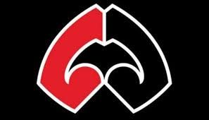
@Stargazer said in Crusaders 2020:
MĀ PANGO MĀ WHERO
• Crusaders evolve their identity with new logo
• Club will remain the Crusaders and reclaim its meaning through a new brand

The Crusaders and New Zealand Rugby (NZR) have today (Friday 29 November 2019) announced the outcome of a comprehensive review of the Crusaders brand. The club has presented its unique brand story to key stakeholders, which includes the introduction of a new logo, inspired by our region and the whakataukī ‘mā pango, mā whero, ka oti te mahi.’

Crusaders Chairman Grant Jarrold said: “This brand review represents a significant body of work, that has looked into all aspects of our club’s identity, and has given us a much clearer picture of who we are, what we stand for, and how we are seen by others. This has helped to inform some important decisions about our brand going forward.”

A full review was confirmed back in June and brand agency, Designworks, was commissioned to complete the work, including an audit of the club, understanding and development of the club’s story, the development of name and identity options, and refinement of the brand. Led by the Crusaders and NZR Boards, and following significant consultation, Designworks
helped the club develop an identity story – a description of who we are and what we represent. It reaffirmed that:

o We are here to do good for each other and for our community.
o We are inclusive; we welcome others into our whānau, building a sense of belonging in something that is more than rugby.
o We have a culture that enables people to enjoy themselves, to be themselves, and to believe in themselves.
o Our people are true to themselves, and selfless for others. They are proud individuals, connected to a common cause.
o We are leaders in our sport, and in our community.
o We represent our legacy with pride; we represent the collective strength of our six unions; and we reflect the passion and pride of our fans, gaining strength from their support and giving it back.
o We are for each other. Winning rugby is just the result.
Crusaders CEO Colin Mansbridge said: “Once we had a clear identity story, we needed to ensure we have a brand that accurately and authentically reflects that moving forward. The research showed us that the brand element people most strongly connected with was our colours – red and black. The whakataukī, ‘mā pango, mā whero, ka oti te mahi’ which speaks to the concept of ‘With black and with red we will achieve’ has become an inspiring proverb for us because of its relevance to what we stand for, and that is reflected in the new branding.” The Tohu (symbol) is shaped by our natural landscape which stretches from the top of the Southern Alps to the depths of our moana. Taking the form of the letter ‘C’ but expressed in a way that is unique to us. It nods to our legacy while moving us forward. Brought together through the substance of our colours, mā pango (the colour of infinite potential) and mā whero (the colour of true leadership.) It is the combination of these rich ingredients that defines the Crusaders and our evolved identity. “When we took a thorough and honest look into who we are, the imagery we were using, with its nod to Christchurch’s English heritage, did not effectively portray the region we represent or who we are as a team. For example, we represent the top of the South Island, not just from Ōtautahi or Canterbury, and our team is diverse and multi-cultural. We believe that the logo we have launched today is a much more fitting representation of this team, organisation and its supporters,” Mr Mansbridge said. The Crusaders will introduce the new logo in its marketing and at-game collateral in 2020, as much as is practically possible. While the main focus of the brand review was not the club’s name, it did consider whether alternative name options would more accurately reflect the club’s identity and story. Ultimately, it was decided that no name better represented the club’s commitment to living its values - crusading for social improvement and inclusiveness, and crusading with heart for our community and for each other - than ‘Crusaders’ did. Mr Mansbridge also reaffirmed the importance of celebrating the club’s history moving forward: “The brand review was future-focused, but we were clear from the beginning of this process that our past is an integral part of who we are. This club has an incredibly proud history, and celebrating that history is always going to be a vital part of our brand story. We will continue to tell that story with immense pride, but that does not prevent us from evolving and taking an exciting step forward.”Crusaders Head Coach Scott Robertson added: “When you’re a leader you’ve got to know where you’ve come from to know where you’re going, and the legacy of this club is a big part of who we are. This process has been invaluable in helping us to reaffirm where we’ve come from and to find a clear direction going forward. We look forward to taking this brand into the future with the people of the Crusaders region alongside us.” NZR Head of Professional Rugby Chris Lendrum added: “A brand review of this nature is both a challenge and a huge opportunity so, alongside the Crusaders Board, we sought out some of the top research and brand agencies in New Zealand to help ensure that we got this right. Thank you to Research First and Allen + Clark for their initial research, and to Designworks for undertaking such a comprehensive brand review. I’d also like to thank everyone who has taken part in this process, for their honest and heartfelt input. “A brand is much more than a name or a logo and going through this brand review has shown us that it is the values and legacy of this club that really resonates with fans. Those are the things that we need to value and retain, even as the Crusaders brand evolves.” Mr Mansbridge concluded: “We have consulted widely and had many, many conversations with a range of people throughout this process. This has set us on a path to form new relationships that we didn’t previously have, and build on existing relationships to take them to a deeper level of understanding and appreciation. What we have learned from this process is that more kōrero equals more understanding and we look forward to continuing to engage with our stakeholders – from our staff and players, to commercial partners, provincial unions and fans - as we embark on this brand evolution together.”One of the great things about my job is never having to sit through endless meetings where people speak this kind of corporate wankery .
"we decided to harness our creative synergies and come up with a symbol that neatly encapsulated all the Canterbury is known for. So the new logo which simulates the damaged double helix of a DNA string from years of inbreeding and recessive genetics will going forward be what people associate the Crusaders with.
-
Each to their own. I like what they're trying to do - connecting the team, the name, their region & its people (which is much more diverse nowadays - and so is the team), symbolised in a new logo; I like it the same way I like what the Chiefs are doing with their "Chiefs Mana" motto, which cynics can also easily dismiss as commercially motivated.
To some of you it may come across as marketing bullshit and yes, it's about branding, but I'm sure that it's much more & genuine for the players, coaches and staff involved. To them, the story behind the logo won't just be "corporate wankery".
I'm not completely sold on the logo (I particularly dislike the black background), but know from my own experience that it is actually very hard to make a good logo that represents what you want it to, and has to be accepted by those who matter.
But at the end of the day, it's still only a logo, a symbol.
-
@Stargazer said in Crusaders 2020:
Each to their own. I like what they're trying to do - connecting the team, the name, their region & its people (which is much more diverse nowadays - and so is the team), symbolised in a new logo; I like it the same way I like what the Chiefs are doing with their "Chiefs Mana" motto, which cynics can also easily dismiss as commercially motivated.
To some of you it may come across as marketing bullshit and yes, it's about branding, but I'm sure that it's much more & genuine for the players, coaches and staff involved. To them, the story behind the logo won't just be "corporate wankery".
I'm not completely sold on the logo (I particularly dislike the black background), but know from my own experience that it is actually very hard to make a good logo that represents what you want it to, and has to be accepted by those who matter.
But at the end of the day, it's still only a logo, a symbol.
That article is the epitome of corporate wankery , "going forward " "moving forward" "having the conversation" "the process" "future-focussed" "clear identity story" its all there but I think they really peaked with this particular example of the onanists art
"The Crusaders will introduce the new logo in its marketing and at-game collateral in 2020, as much as is practically possible."

I'd love to know how long this actually took and how much it all cost.
-
@jegga As I said, each to their own. The fact that it's about branding doesn't exclude that there has been a genuine effort to design a logo that is not only the visual representation of the brand "Crusaders" but also a symbol of what they want it to stand for: their identity and the connection between the team, the name, their region & its people. It can be both.
The media release just explains how they came up with the design and what it symbolises. The video does that in a different way. It's good to remember that media releases do not only contain info for Crusaders fans or rugby fans in general, but also for sponsors and business partners.
Anyway, maybe we should discuss this in the name change thread and not here, as this is not a discussion about rugby, players or even the team anymore.
-
Now the PC brigade has failed in changing the Crusaders name we will probably have to sit through shit like, the Highlanders have a sword get rid of it,
The Blues name is too close to depression thats got to go, or the Hurricanes are called after a nasty weather event that has to go the Chiefs well who knows something will be thought up. -
Even NZs biggest cuck Guy Williams thinks it’s ordinary.
Much credit to the Muslim community who were consulted but wanted no part in the decision .
-
Wht was wrong with just a "C" ????
-
-
Some of the comments have been hilarious.
:::
:::