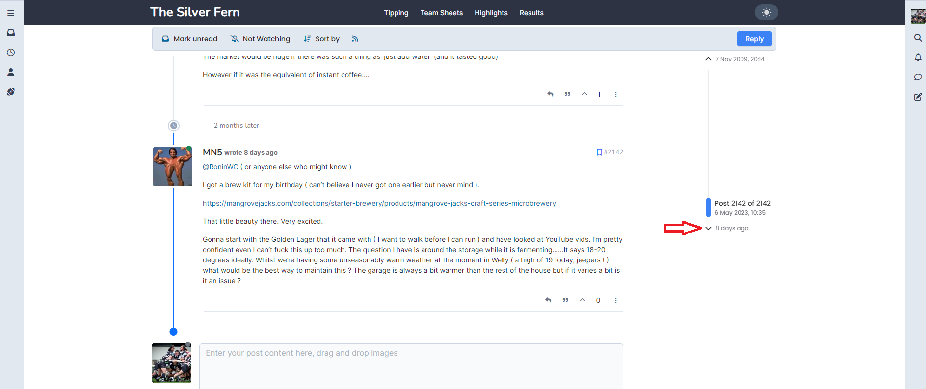
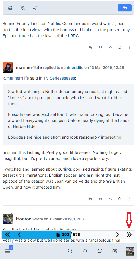
-
FYI
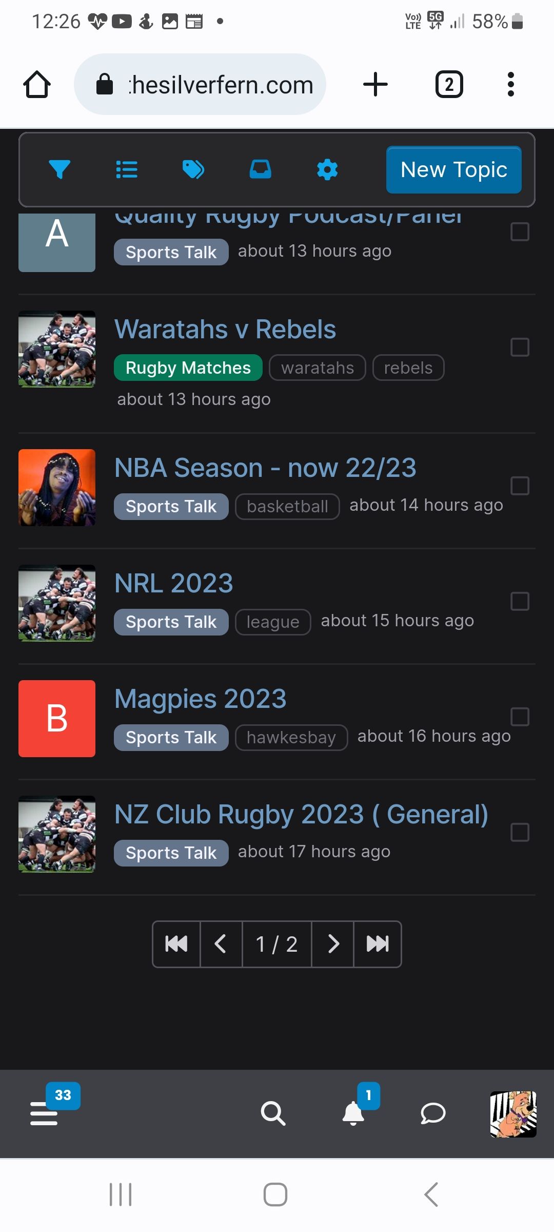
Just noticed the navigation arrows (not sure proper name) at the bottom are covered.
See bottom of screenshot.
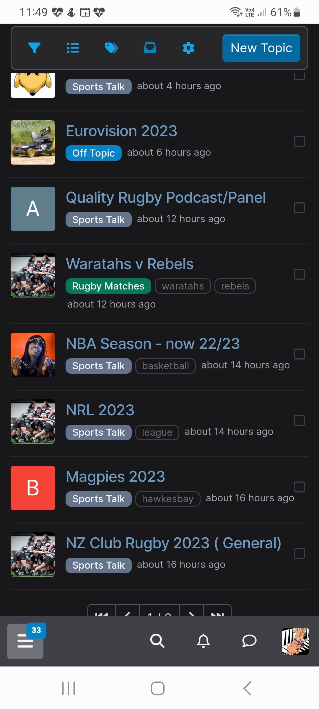
Edit: i.e., can't get to second page
-
@Duluth said in What Changed?:
@booboo said in TSF Maintenance at midday:
Just noticed the navigation arrows (not sure proper name) at the bottom are covered.
Refresh. That better?
Yep. Ta
-
Looks nice thanks. One small question - Is it possible to display the number of posts in each thread?
-
@No-Quarter said in What Changed?:
Looks nice thanks. One small question - Is it possible to display the number of posts in each thread?
In the unread, recent and category views?
I assume you’re on a phone. It shows on larger screen sizes. I should be able to make it show on phone sizes too
-
@No-Quarter just count them ( obviously much harder in any thread involving Foster )
-
All worked fine for me. Will take a day or two to get used to the new layout.
Screen layout on the Chrome shortcut on my Android phone is way better
-
If one is to be be particularly picky ... I do find the default UI quite bright.
If there's any easy of dialing back the brightness that'd be great.
Conversely am not a fan of the dark mode ... if there's any way of making that less dark ... 😀
-
PS Dark mode is preferable. Is very harsh on my GOM eyes otherwise.
What Changed?
