-
@Duluth said in What Changed?:
@booboo said in TSF Maintenance at midday:
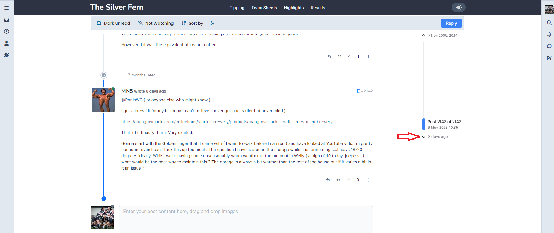
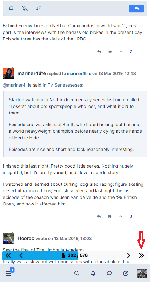
Just noticed the navigation arrows (not sure proper name) at the bottom are covered.
Refresh. That better?
Yep. Ta

-
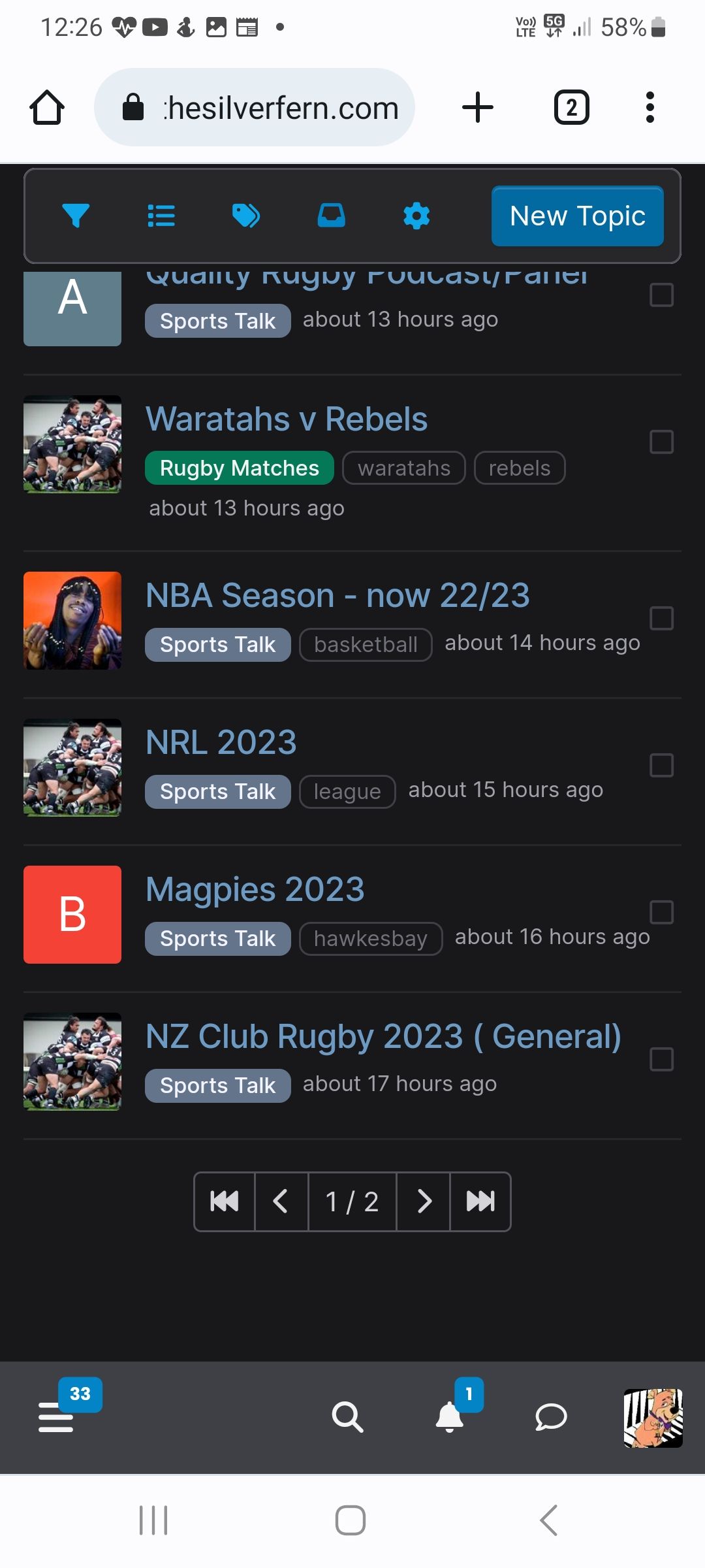
Looks nice thanks. One small question - Is it possible to display the number of posts in each thread?
-
@No-Quarter said in What Changed?:
Looks nice thanks. One small question - Is it possible to display the number of posts in each thread?
In the unread, recent and category views?
I assume you’re on a phone. It shows on larger screen sizes. I should be able to make it show on phone sizes too
-
@No-Quarter just count them ( obviously much harder in any thread involving Foster )
-
All worked fine for me. Will take a day or two to get used to the new layout.
Screen layout on the Chrome shortcut on my Android phone is way better
-
If one is to be be particularly picky ... I do find the default UI quite bright.
If there's any easy of dialing back the brightness that'd be great.
Conversely am not a fan of the dark mode ... if there's any way of making that less dark ... 😀
-
PS Dark mode is preferable. Is very harsh on my GOM eyes otherwise.
-
@Duluth I don't remember how it was before the change, but is it possible to make the thread title stay visible when you scroll down the posts, so you can actually see what thread you're in?
Another thing: can you make these icons visible when you hide the preview?

Edit: it may not be hiding the preview; maybe it's when you don't expand? If you expand, you see the icons; if you don't expand you don't see them.
Anyway, is it possible to have the preview open by default?
What Changed?


