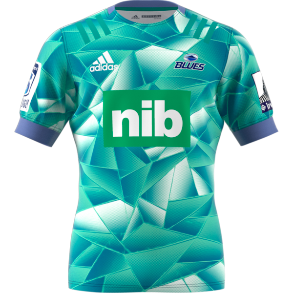
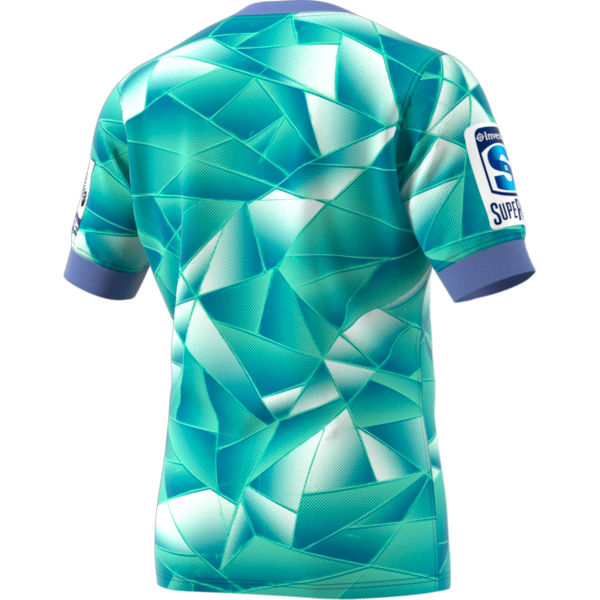
• Categories
Collapse

The Silver Fern

Blues 2020

Scheduled Pinned Locked Moved Sports Talk
blues
1.6k Posts 81 Posters 158.6k Views
Blues 2020
    • Oldest to Newest
    • Newest to Oldest
    • Most Votes
Reply
  • Reply as topic
Log in to reply
This topic has been deleted. Only users with topic management privileges can see it.
  • M Offline
    M Offline
    Machpants
    wrote on last edited by Machpants
    #522

    I like it EDIT to clarify, I don't think it's terrible like the canes one 😞

    1 Reply Last reply
    0
  • KiwiMurphK Online
    KiwiMurphK Online
    KiwiMurph
    wrote on last edited by
    #523

    Looks like the actual version might be a bit brighter which improves it somewhat.

    alt text

    ChrisC 1 Reply Last reply
    0
  • boobooB Do not disturb
    boobooB Do not disturb
    booboo
    replied to Yeetyaah on last edited by
    #524

    @Yeetyaah said in Blues 2020:

    ED7973_APP_virtual_front_transparent.png ED7973_APP_virtual_back_transparent.png

    Training

    Like that

    J 1 Reply Last reply
    1
  • J Offline
    J Offline
    Jonty lean
    replied to booboo on last edited by
    #525

    All teams last years Jersey looked better

    1 Reply Last reply
    0
  • DuluthD Offline
    DuluthD Offline
    Duluth
    wrote on last edited by
    #526

    It’s ok

    The Blues can’t have a good jersey while they have the massive green nib panel

    It’ll never happen, but I’d like navy blue and cambridge blue hoops representing Auckland and Northland. Maybe black shorts for Harbour.. no maroon

    1 Reply Last reply
    5
  • KiwiMurphK Online
    KiwiMurphK Online
    KiwiMurph
    wrote on last edited by
    #527

    The Harlequin style special Blues jersey they wore a couple of times a few years ago was sweet.

    1 Reply Last reply
    0
  • StargazerS Offline
    StargazerS Offline
    Stargazer
    wrote on last edited by
    #528

    taniwharugbyT antipodeanA 2 Replies Last reply
    0
  • taniwharugbyT Offline
    taniwharugbyT Offline
    taniwharugby
    replied to Stargazer on last edited by taniwharugby
    #529

    @Stargazer what a crock, how the marketing team sold that concept 🙄

    Amazing how they can take a simple rugby jersey and try to justify why it looks shit.

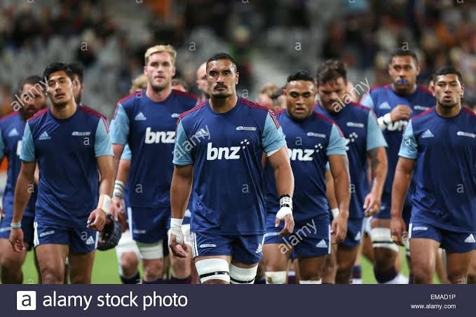
    Was this only a training Jersey? One of the better looking ones IMO.
    images.jpeg

    DiceD KiwiMurphK M 3 Replies Last reply
    4
  • BovidaeB Offline
    BovidaeB Offline
    Bovidae
    wrote on last edited by
    #530

    Common sense would suggest that the away jersey or training jersey should incorporate the colours of other provinces within the franchise if they aren't featured in the main jersey.

    1 Reply Last reply
    0
  • DiceD Offline
    DiceD Offline
    Dice
    replied to taniwharugby on last edited by
    #531

    @taniwharugby was that a jersey or a t-shirt?

    We use to have a jersey with those maroon stripes on the shoulders. No cambridge blue on it though.
    alt text

    YeetyaahY 1 Reply Last reply
    0
  • KiwiMurphK Online
    KiwiMurphK Online
    KiwiMurph
    replied to taniwharugby on last edited by
    #532

    @taniwharugby I have that one. It was a performance/training T shirt.

    taniwharugbyT 1 Reply Last reply
    0
  • taniwharugbyT Offline
    taniwharugbyT Offline
    taniwharugby
    replied to KiwiMurph on last edited by taniwharugby
    #533

    @KiwiMurph looks good though

    That's ugly too @Dice

    1 Reply Last reply
    3
  • YeetyaahY Offline
    YeetyaahY Offline
    Yeetyaah
    replied to Dice on last edited by
    #534

    @Dice that's the 2000 jersey so maybe it was designed in 99 when Northland was still a Chiefs territory then they switched and didn't wanna redesign.

    KiwiMurphK 1 Reply Last reply
    1
  • KiwiMurphK Online
    KiwiMurphK Online
    KiwiMurph
    replied to Yeetyaah on last edited by
    #535

    @Yeetyaah Northland was part of the Blues in 99.

    YeetyaahY 1 Reply Last reply
    0
  • YeetyaahY Offline
    YeetyaahY Offline
    Yeetyaah
    replied to KiwiMurph on last edited by
    #536

    @KiwiMurph I thought they switched at the end of the 90s as the Chiefs still had blue on their kit.

    BovidaeB 1 Reply Last reply
    0
  • ChrisC Offline
    ChrisC Offline
    Chris
    replied to KiwiMurph on last edited by Chris
    #537

    @KiwiMurph Looks like a shattered window maybe the correct design then. or a very bad tile design in a bathroom.

    1 Reply Last reply
    0
  • BovidaeB Offline
    BovidaeB Offline
    Bovidae
    replied to Yeetyaah on last edited by
    #538

    @Yeetyaah They switched from the 1999 season. I actually went to a Chiefs home game (vs NSW) at Albany.

    taniwharugbyT 1 Reply Last reply
    0
  • antipodeanA Offline
    antipodeanA Offline
    antipodean
    replied to Stargazer on last edited by
    #539

    @Stargazer said in Blues 2020:

    I'm willing to wager a substantial sum that marketing tried to justify that horrid design rather than went to a designer with those words first.

    The person responsible for that should have their crayons taken away.

    1 Reply Last reply
    2
  • taniwharugbyT Offline
    taniwharugbyT Offline
    taniwharugby
    replied to Bovidae on last edited by
    #540

    @Bovidae yea i went to one in 97 at Albany where the Chiefs hosted the Blues.

    DuluthD 1 Reply Last reply
    0
  • DuluthD Offline
    DuluthD Offline
    Duluth
    replied to taniwharugby on last edited by
    #541

    @taniwharugby said in Blues 2020:

    yea i went to one in 97 at Albany where the Chiefs hosted the Blues.

    The Chiefs were meant to be based in Harbour. Most of the unions that made up the Chiefs wanted Hamilton and they won an appeal against the NZRFU

    1 Reply Last reply
    1

Blues 2020
Sports Talk
blues
  • Login

  • Don't have an account? Register

  • Login or register to search.
  • First post
    Last post
0
  • Categories
  • Login

  • Don't have an account? Register

  • Login or register to search.